What can a hotel do in its remodeling to calm people from pandemic stress? One of the most subtle and creative moves is to use colors that inspire relaxation. Every color of the spectrum communicates feelings with people based on their own association and personal experience. Here's a look at the color trends for hotels in 2021, offering relaxation.
Why Colors Matter
Every business owner or marketer should have some sense of color psychology since it goes a long way in connecting with consumers. While every individual identifies with their own interpretation of colors, certain predictable response patterns exist in a culture. Blue, green, and brown naturally are earthy colors linked with nature. Bright red associates with aggression or danger. Yellow and orange reflect fun energy, while black and white have universal appeal and mix well with many colors.
One thing color psychology researchers have known for decades is that color stimulates human emotions. Meanwhile, it became clear in 2020 that the environment affects people's physical and mental health. If you put these puzzle pieces together, it's easy to understand why room colors are significant.
The pandemic has led businesses, including hotels, to adopt new safety protocols, which can communicate stress if not executed carefully. Certain colors, however, can counter stressful perceptions and add comfort to hotel rooms and lobbies.
Color Trends That Promote Relaxation
Paint colors that promote feelings of calmness include a saturated ginger orange, almost like a dark blush, and brown beige. Both colors have earthy associations and help promote a feeling of tranquility. They work nicely in restaurants, lounges, and spas.
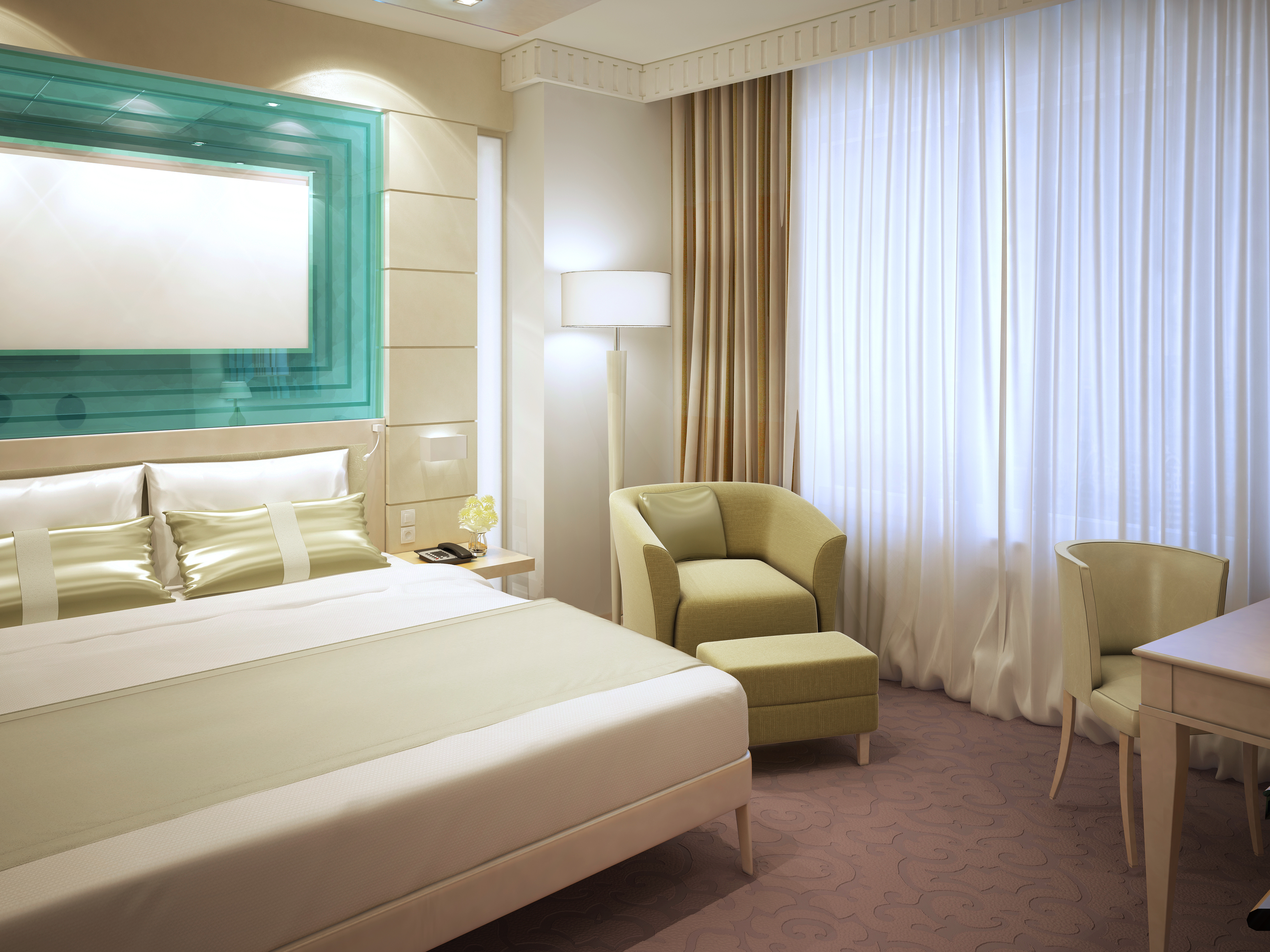
Another peaceful and relaxing paint color is a muted, tropical turquoise aqua, which is an ethereal light blue color that associates with the sky and sea imagery. The combination of these colors can evoke feelings of natural serenity and a home away from home. These refreshing soft color tones contribute to perceptions of a warm and friendly atmosphere but must be applied carefully to be effective.
The color trends that center around comfort space can affect employees as well, which is important for the complete hotel experience. The combination of these factors ideally generates a non-aggressive environment, which is crucial for the hotel industry in attracting guests. The current situation has spread fear, so it's important to create a sense of calmness as much as possible.
In the past, hotels often used blush and coral tones to create a more upbeat atmosphere, but the latest industry color palettes lean toward a more soothing and neutral ambiance. This ideal color scheme for promoting wellness and balance can be achieved when 60 percent of the room has a dominant color, supplemented by a 30 percent secondary color and a 10 percent accented color.
Understanding 2021 color trends are important for hotel stakeholders to consider since it's a way to regain loyal guests by giving them a sense of comfort. Contact Nikki Fox, Nikki@ParkwestGC.com, at
Parkwest General Contractors to learn more about creating a soothing hotel ambiance. Our experienced team is ready to provide guidance for an innovative hotel construction project.